Cherry
As many of my Instagram followers will know creating a dark bedroom was a huge leap of faith when I dared to make this colour choice. Our bedroom has always been full of light because it is a south facing room. However, it always felt like a little light box and so never felt like a restful place.
Before
These pictures show what the colour scheme looked like originally which was lovely and bright but felt rather cold and stark with it.
Colour choices
I’d read a lot about how dark colours can actually create warmth and that they give you that ‘just been hugged’ feeling. Now that I have a dark bedroom, I really understand this. When I first set out on my colour choice I wanted to make the bedroom feel more luxurious but an easier place to sleep in and unwind. I really recommend trying a variety of colours as they look so different in different lights (day/night), according to the position of room (north/south etc) and light fixings. The dark wall colour I selected was Hague Blue, I first of all painted it on a wooden board with a range of colours and then I tested it out on plaster to see if it looked how I imagined. At this stage, I felt it looked quite cold but as soon as I placed my pink flowers in front of the plaster the room seemed to come alive.
This contrast of Blue and Pink confirmed to me that I had to have some pink on the walls too! I’ve always loved Antoinette Chalk Paint from Annie Sloan and so I knew her wall paint would look lovely in contrast to Hague Blue by Farrow and Ball. For the skirting, I used Dix Blue as it is a favourite colour of mine and I took the advice off the Farrow and Ball Website which recommends it as a colour pop against Hague Blue.
Now the final paint choices were tricky, as I was unsure what colour to paint the picture rail but eventually I decided to use pink as I felt it would help enhance the ceiling height of our Victorian home by giving the impression of elongating the height of the ceiling. Annie Sloan doesn’t make a trim paint so luckily I managed to get a perfect match to the paint by getting Valspar paint mixed at B&Q.
The floor had been carpeted but luckily we had decent original floorboards underneath. I didn’t want to sand them as our bedroom has many mahogany pieces of furniture and I felt it would be too dark if the floorboards weren’t painted. I wanted to create a little warmth with the floor so I opted for Farrow and Ball New White which is a slightly warmer white.
How to paint
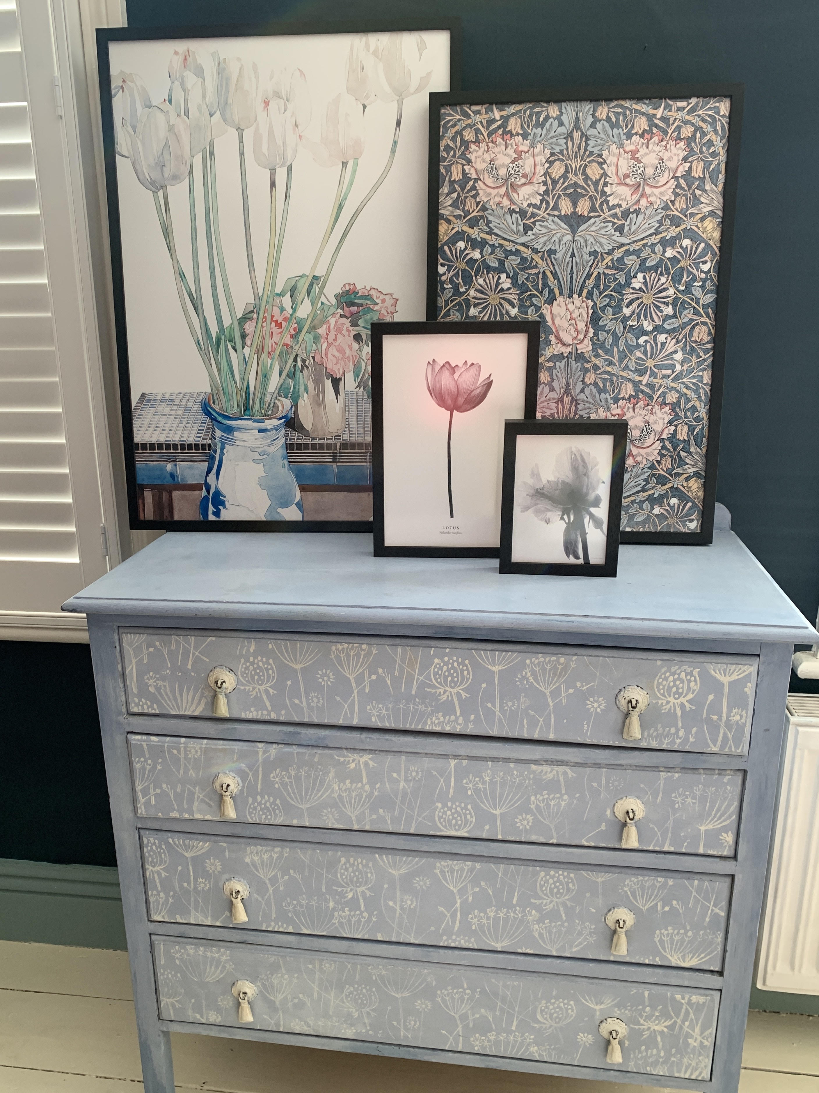
Always start from the top of the room and work down and don’t cut costs with a cheap primer on floorboards, they are watery and have poor coverage. Use masking tape/frog tape to create clean lines. If you want to transform your furniture in your new colour scheme chalk paint will create your desired look quickly but make sure you seal it with wax. Update your furniture by buying some new handles to give them a fresh look.
Dressing the bedroom
I love layering a bedroom with different fabrics and patterns, using a range of old and new fabrics. I’ve had many questions about the bedding picture here which was from Marks and Spencer which unfortunately they no longer sell. I also own some gorgeous relaxed linen bedding from Heals which are great with a family as their is no need to iron and they come in a range of colours and help create a beautiful vintage feel.
Suppliers
Below are a list of the suppliers I used to help create our bedroom look:
Bedding – Marks and Spencer and Heals.
Rugs – Pink rug from H&M (pictured) and cream rug from Cox and Cox.
Paint – Wall Paint – Hague Blue by Farrow and Ball, Floor Paint –New White by Farrow and Wall, Skirting – Dix Blue by Farrow and Ball, Pink Paint above picture rail – Annie Sloan Antoinette Wall Paint and Picture rail wood paint coloured matched by Valspar (B&Q).
Lights – Main chandelier from Marks and Spencer and other lighting supplies from Lights and Lighting Direct.
Cushions – Pink pom-pom cushion by Country Abodes, Other bed cushions by B&Q.
Handles on furniture – Handles for doors and More Handles.
Bed – Marks and Spencer.